Carfromjapan.com · Aug 2023 – Present
Redesigning the inquiry form to reduce drop-off
Carfromjapan.com is a marketplace for used cars from Japan, shipped to the port nearest the buyer; 90–95% of its target users and completed orders come from the U.S. Buyers studied the photos and specs, yet almost all of them left the moment the inquiry form appeared. Our Product Owner asked me to find out why and redesign this step.
- ROLE
- UI/UX Designer
- TIMELINE
- 08/2023 – [TBD]
- TEAM
- [TBD]
- OUTCOME
- 90% → 85%
- target drop-off · A/B test running
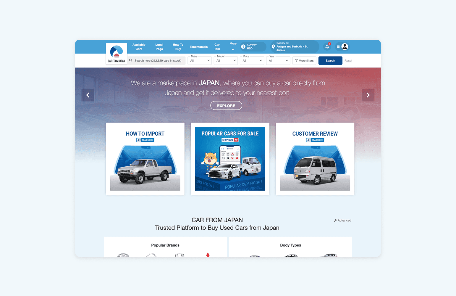
The problem
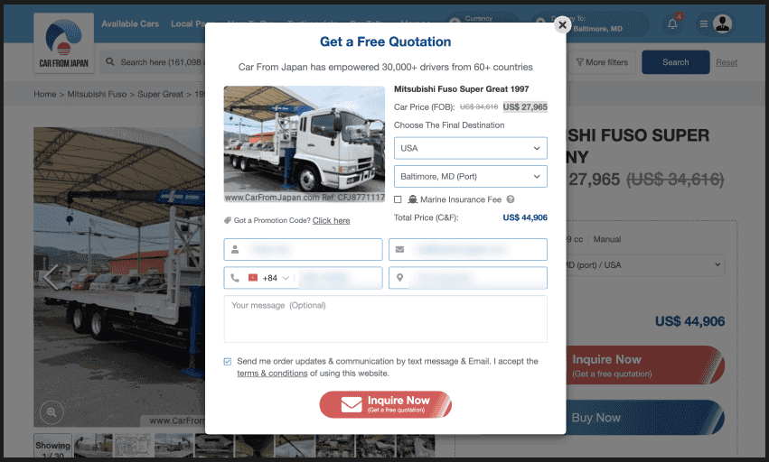
Buyers clicked "Inquire Now (Get a free quotation)" and immediately faced a quote request: the FOB price, country, port, insurance, a promo code, four contact fields and a message box. Buying a car takes a long time to decide, and at this step buyers weren't ready to ask for a quote. They only wanted to know whether the car was still available.
Before & after
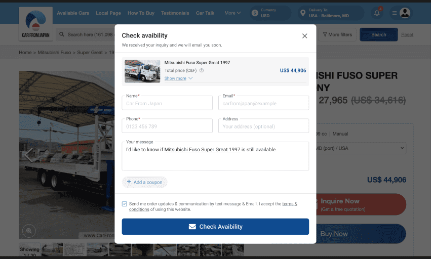
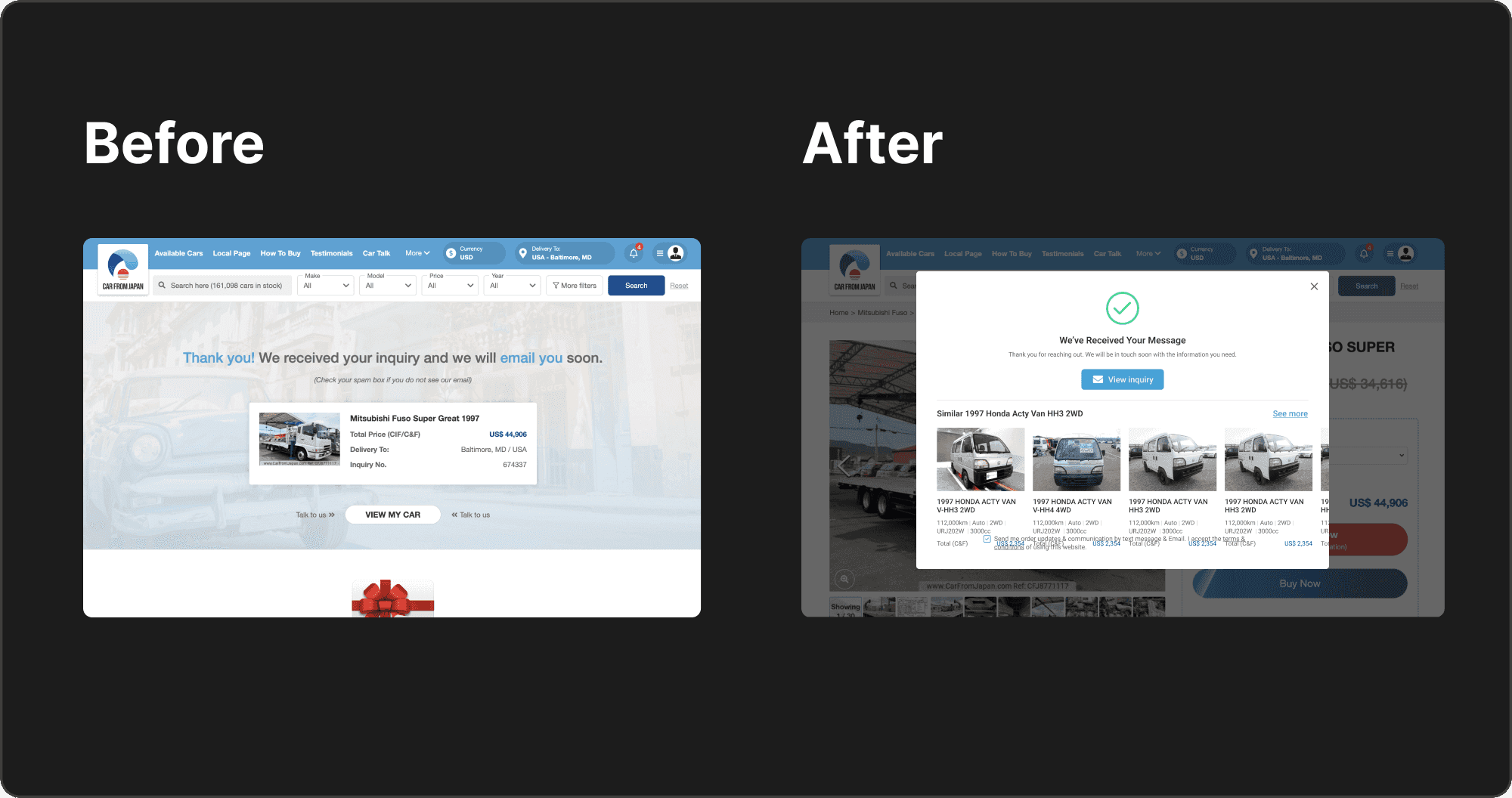
The "Get a Free Quotation" popup and its dozen fields became "Check availability", asking only for name, email, phone and an optional address.
Process
There was no time for formal user research, so I moved fast with an expert review and left validation to the A/B test. The core question: why would someone who had studied a car closely leave when the form appeared? Timeline: [TBD: number of weeks, launch date].
- ResearchDiscoverHeuristic review of the old popup: the title didn't say what the form was for, the visual hierarchy was unclear, and FOB and C&F had no explanation. With the Market team, settled on five competitors: CarGurus, Cars.com, Autotrader, Edmunds and Beforward.
- InsightDefineAll four U.S. sites call this action "Check availability" or "Confirm availability". Buyers weren't ready to ask for a quote; they only wanted to know if the car was still there. Set a guardrail: more inquiries only help if conversion doesn't fall.
- DesignDesignRedesigned three touchpoints: the button label, the form, and the screen after sending. Three of the four U.S. sites confirm on the same page; Beforward suggests similar cars after sending.
- TestingValidateThe new version runs in an A/B test against the old one, alongside a CSAT survey. Results: [TBD].
Solution
The old popup asked as if buyers were ready to order, when they only wanted to know whether the car was available. The fix was structural: the old flow ended on a separate thank-you page, while the new one fits into three screens on the car's own page.
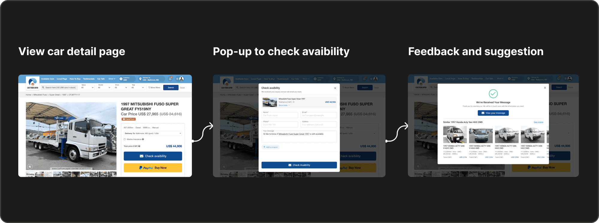
The button became a dark blue "Check availability", matching how U.S. competitors name this action. The form asks only for what's missing: FOB, country, port and insurance left the popup because the detail page already has them, and the message comes prefilled with a question about the car. After sending, buyers see a confirmation on the same page with a row of similar cars, in case theirs is gone.
Results
The new version is still in an A/B test, so there are no impact numbers yet. The cards below are the targets set before design.
Takeaways
- Name the action after what users are already thinking. "Check availability" is the question buyers already had in mind, and it's how all four U.S. competitors name this step.
- A growth target needs a guardrail. More inquiries only help if their conversion doesn't fall with them, so the guardrail metric was set from the start.
- An expert review is only a hypothesis. Every problem in the diagnosis came from a heuristic review; in this project the A/B test was the only check against real users.
You might also like
Building this portfolio 100% with Claude and VS Code
I researched, designed, coded and shipped this bilingual portfolio on my own, using only Claude, VS Code, Git and Vercel.
Personal project· 2026
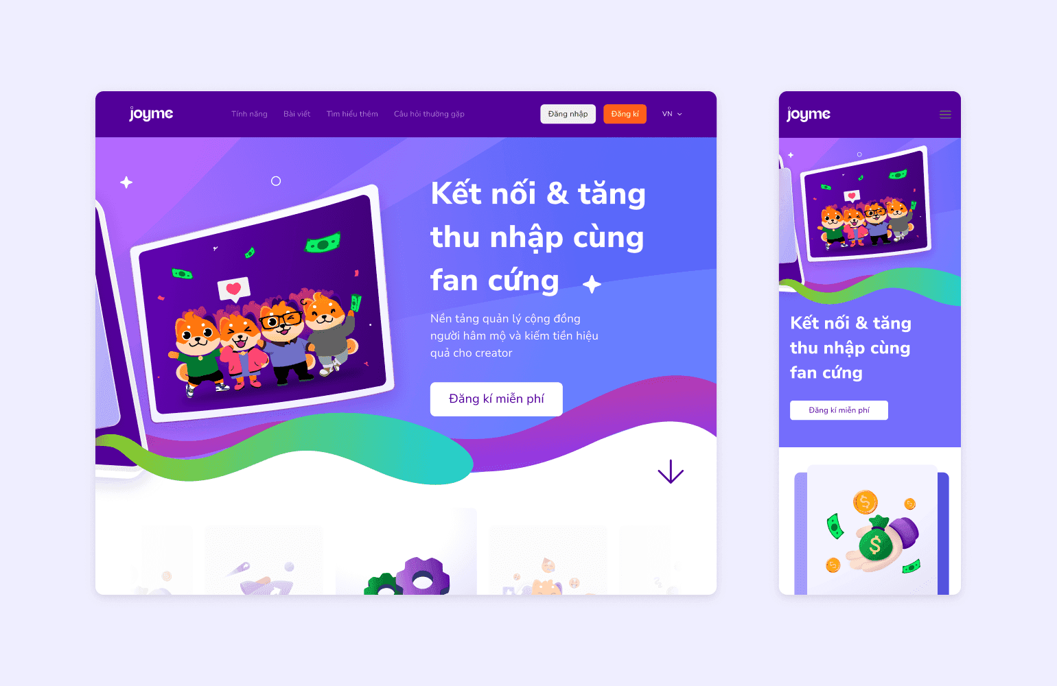
Designing the first version of Joyme in three months
I did UX research, UX, UI and the design system for Joyme, a platform where KOLs and KOCs build a personal page and get paid by their fans.
Joyme.io· 2022
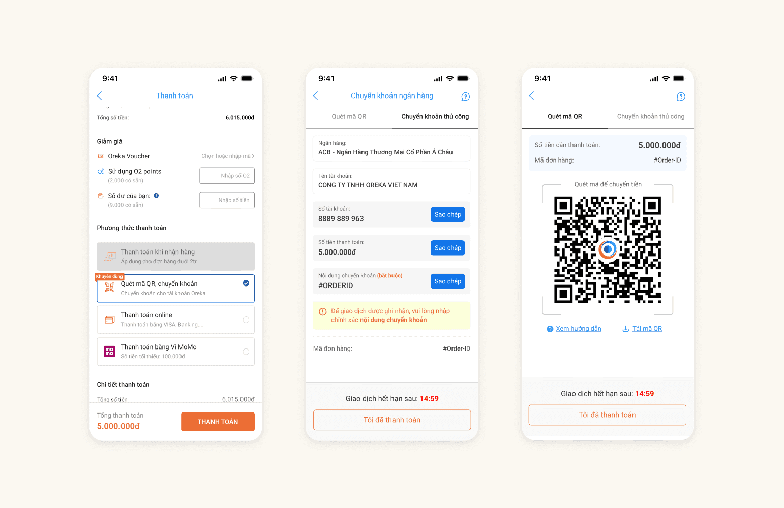
Bank QR code payment at checkout
I designed a bank QR code payment flow for Oreka. Online payments rose from 50% to 53.8%, and bank QR adoption reached 75%.
Oreka.vn· 2023