Joyme.io · Jun 2022 – Jun 2023
Designing the first version of Joyme in three months
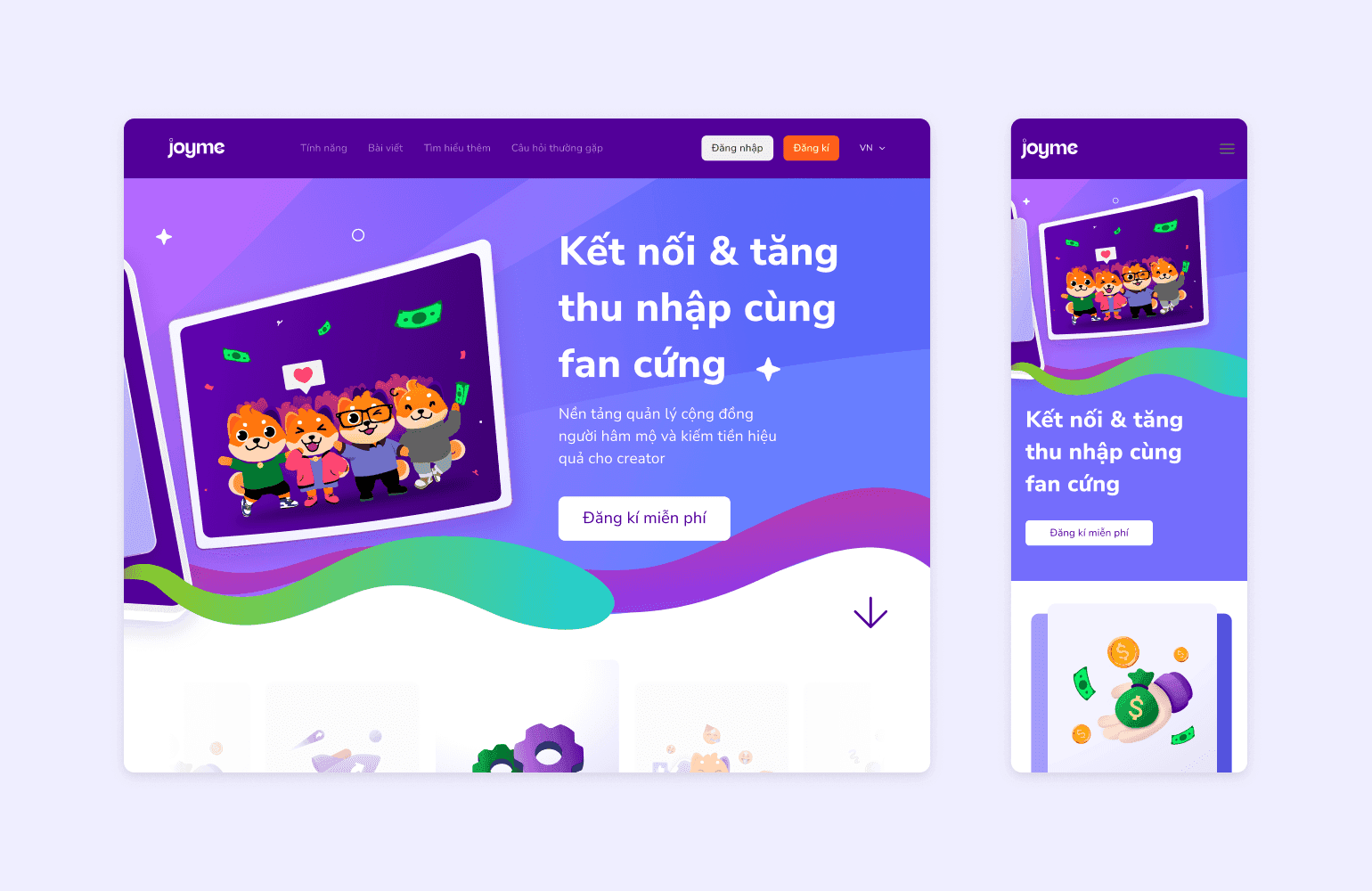
Joyme lets KOLs and KOCs build a personal page on their phone, publish content and receive money directly from fans. We were a small startup that had to ship the first core features on a short deadline, in a market that already had plenty of good page builders. I was responsible for user and competitor research, information architecture, UI and the design system.
- ROLE
- UI/UX Designer
- TIMELINE
- 3 months
- TEAM
- [TBD]
- OUTCOME
- [TBD]
- post-launch metrics
The problem
Creators had to rely on an outside platform to receive money from fans, and fans had no reason to come back after their first visit. Page building was not the gap: the four apps KOLs and KOCs in Vietnam commonly use all handle it well. The problem was not the page builder. Competitors had page building covered; the gap was getting paid and keeping fans around.
Process
A short deadline and one question: where does Joyme have to be different for creators to switch? We chose to launch early and learn from real feedback, so I cut research down to the methods that paid off fastest and moved straight into structure and UI.
- ResearchDiscoverRead user reviews of competing apps and scored five page-building criteria on a 0–5 scale. Beacons scored 5.0 on all five; Passio came last, with 2.0 for customization and adding blocks.
- InsightDefineGrouped the reviews into pain and need cards. Conclusion: competitors' page-building scores were the baseline to meet, and the room to stand out was getting paid and keeping fans — two things the scoring table never measured.
- DesignDesignSplit the app into five branches (creator home, theme editing, adding content, wallet, fan group), with the home page linking to the other four. Built the design system alongside, including empty, 404 and lost-connection states.
- TestingValidate[TBD: who it was tested with, how many people, key findings and what changed after testing.]
Solution
Since page building only had to match competitors, I kept it lean on the phone and put the effort into the two gaps: getting paid and keeping fans. The four decisions below follow that order.
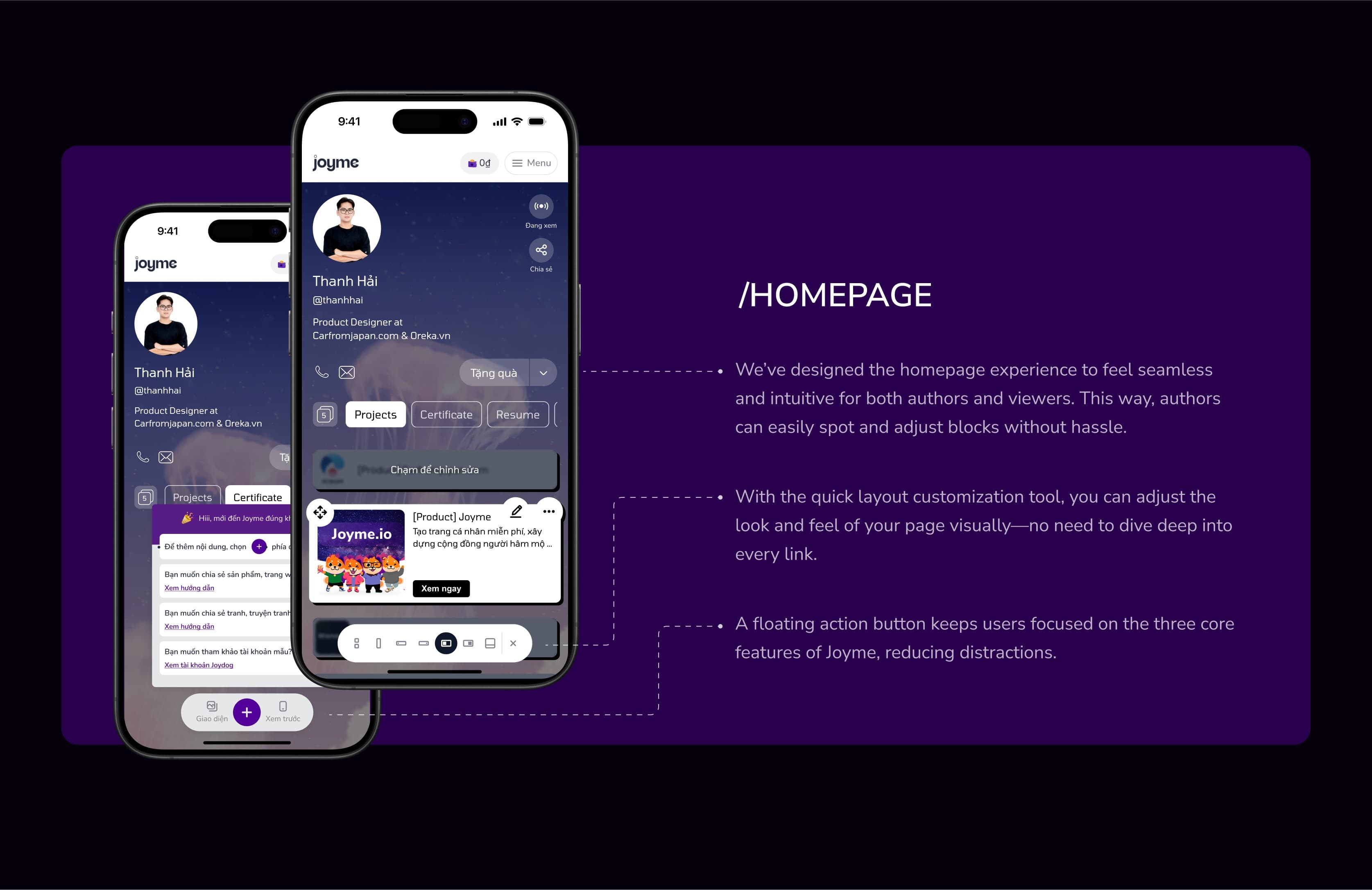
Edit the page in place
Managing a page on a phone was where competitors fell short, so creators tap a block on their own page to edit it, change its layout from a floating bar, and restyle the page with themed templates.
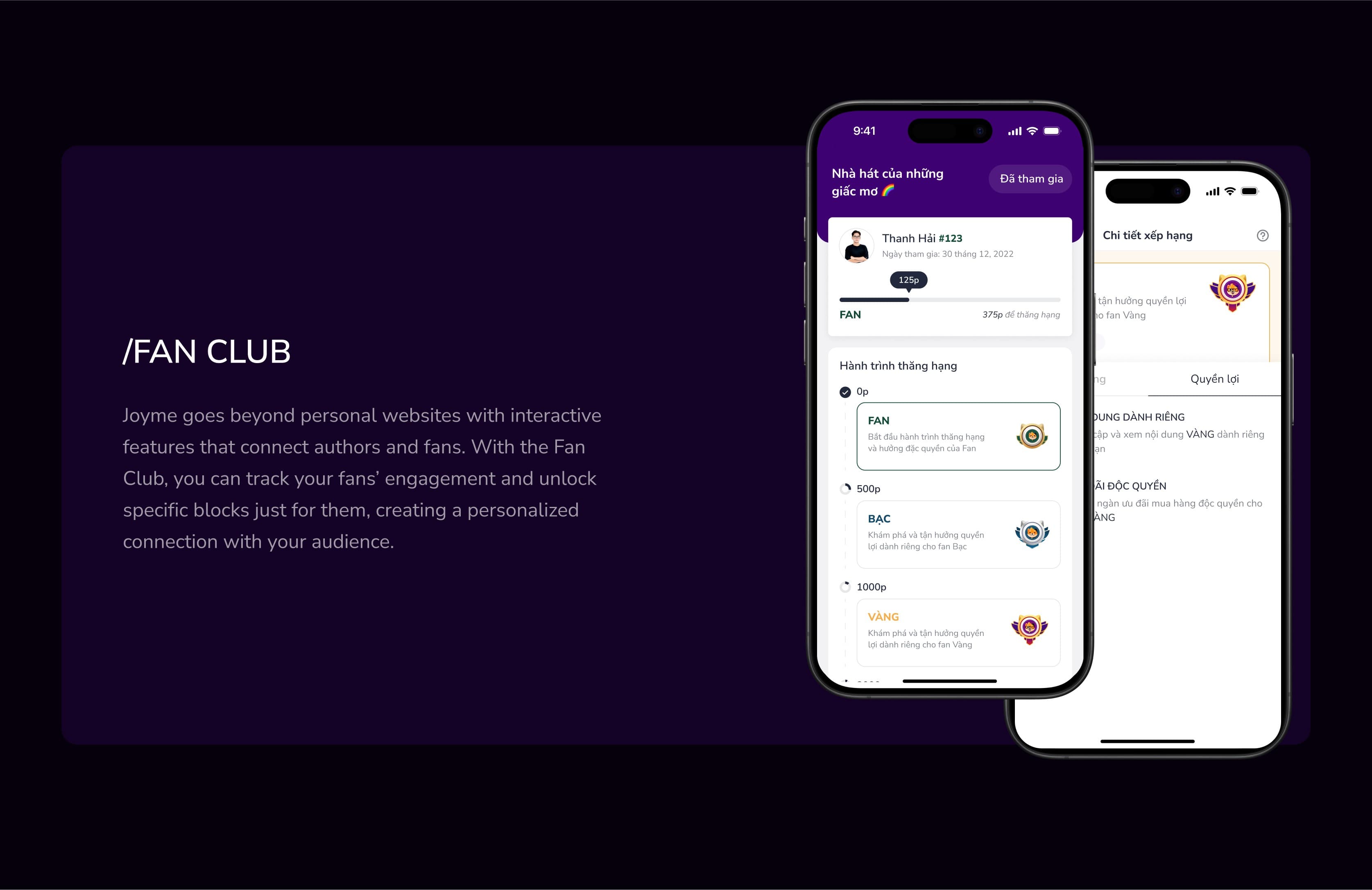
Fan Club: ranks that bring fans back
Fans earn points to move up from Fan to Silver, Gold and Diamond (Fan from 0 points, Silver from 500, Gold from 1,000). The member card always shows the points still needed, such as "375p to rank up", so the next step is visible.
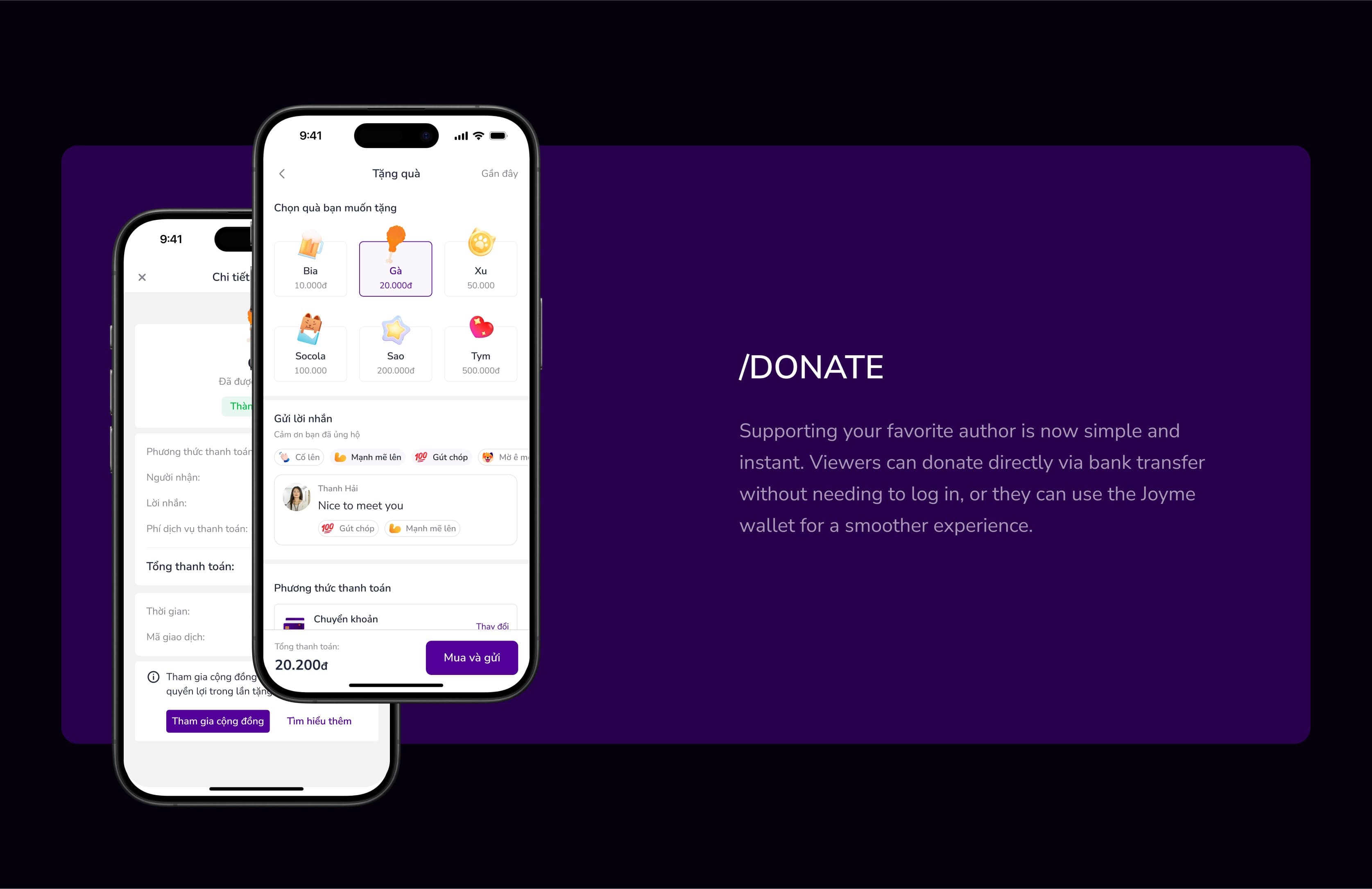
Gifting without signing in
Viewers send a gift by bank transfer without an account. Each gift has a fixed price, from a 10,000đ Beer to a 500,000đ Heart, so supporters pick an item instead of inventing an amount; afterwards, a Join community button takes them into Fan Club.
Wallet: see every amount before you confirm
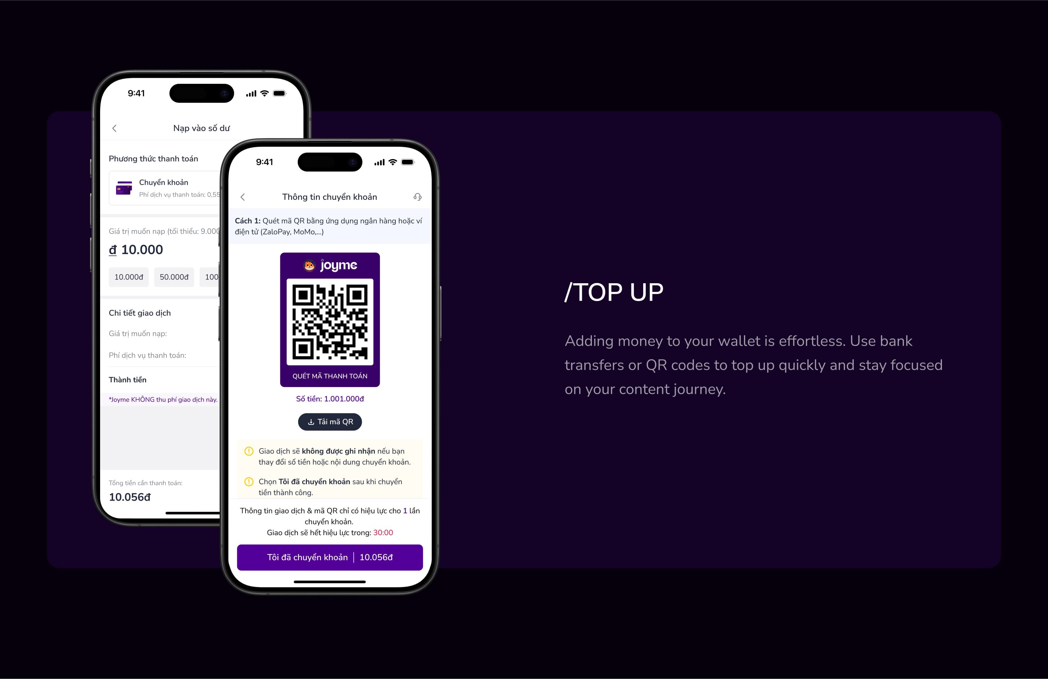
The top-up screen shows the service fee and puts the total to transfer on the confirm button; each QR code works once and expires after 30 minutes. When withdrawing, the amount actually received sits next to the Continue button.
Results
Joyme launched at joyme.io and is still in development. This case does not yet include post-launch usage data, so the two cards below are project outputs, not impact.
Takeaways
- Competitors set the baseline; the difference lies where they don't measure. The scoring table showed page building was saturated, so the effort went into getting paid and keeping fans.
- With money, show every figure before the tap. The fee, the total to transfer and the amount received all sit next to the confirm button, not hidden in a later step.
- Fast research has a cost. Early decisions rested on what competitors' users said, not yet on Joyme's own creators. [TBD: what you would do differently next time.]
You might also like
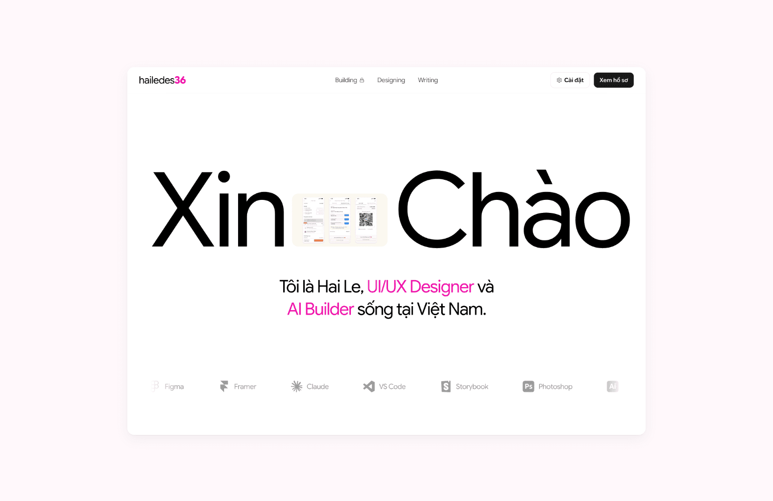
Building this portfolio 100% with Claude and VS Code
I researched, designed, coded and shipped this bilingual portfolio on my own, using only Claude, VS Code, Git and Vercel.
Personal project· 2026
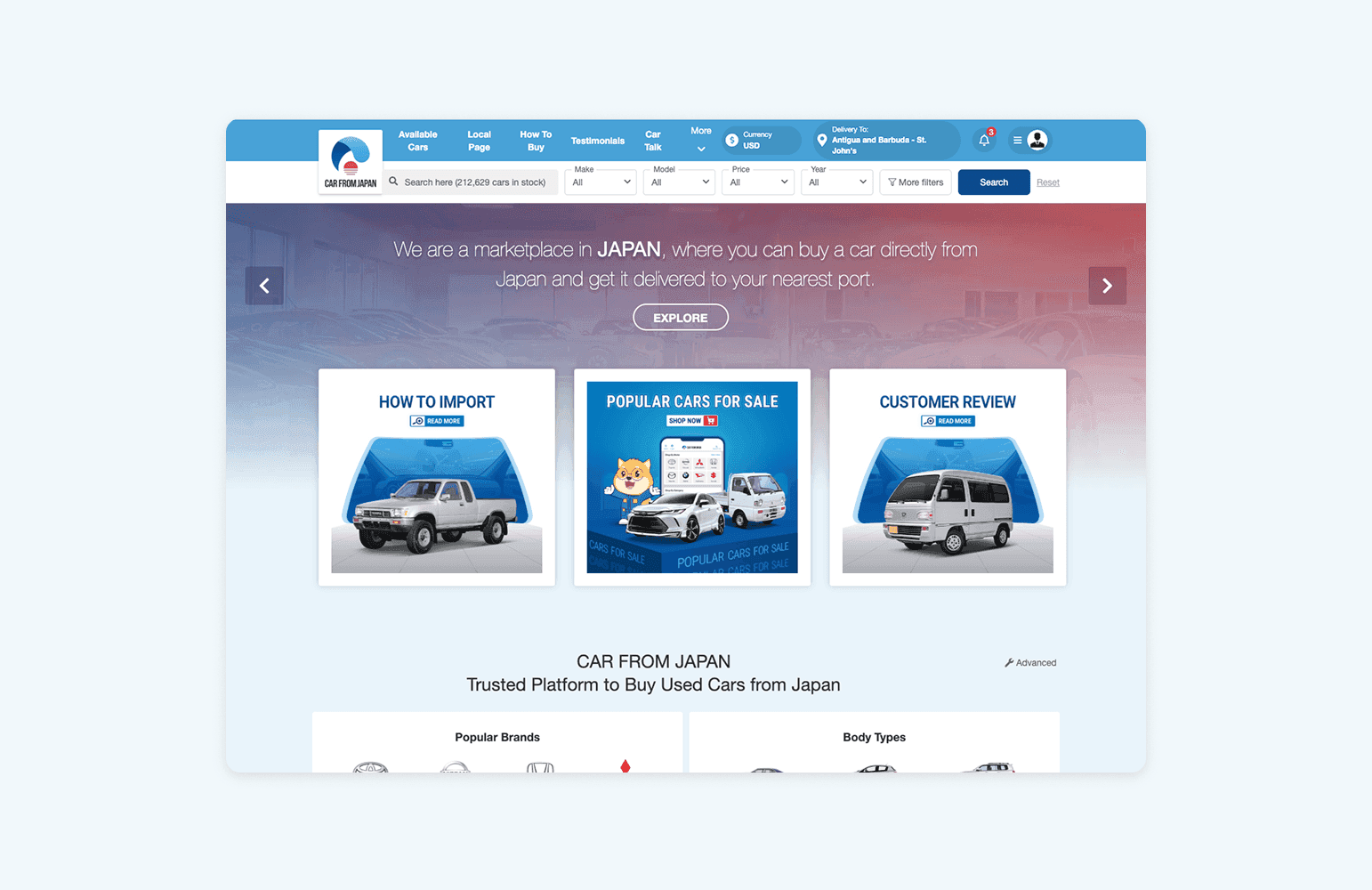
Redesigning the inquiry form to reduce drop-off
About 90% of Carfromjapan.com users left at the inquiry form. I redesigned the button, form and confirmation; the new flow is in an A/B test.
Carfromjapan.com· 2023
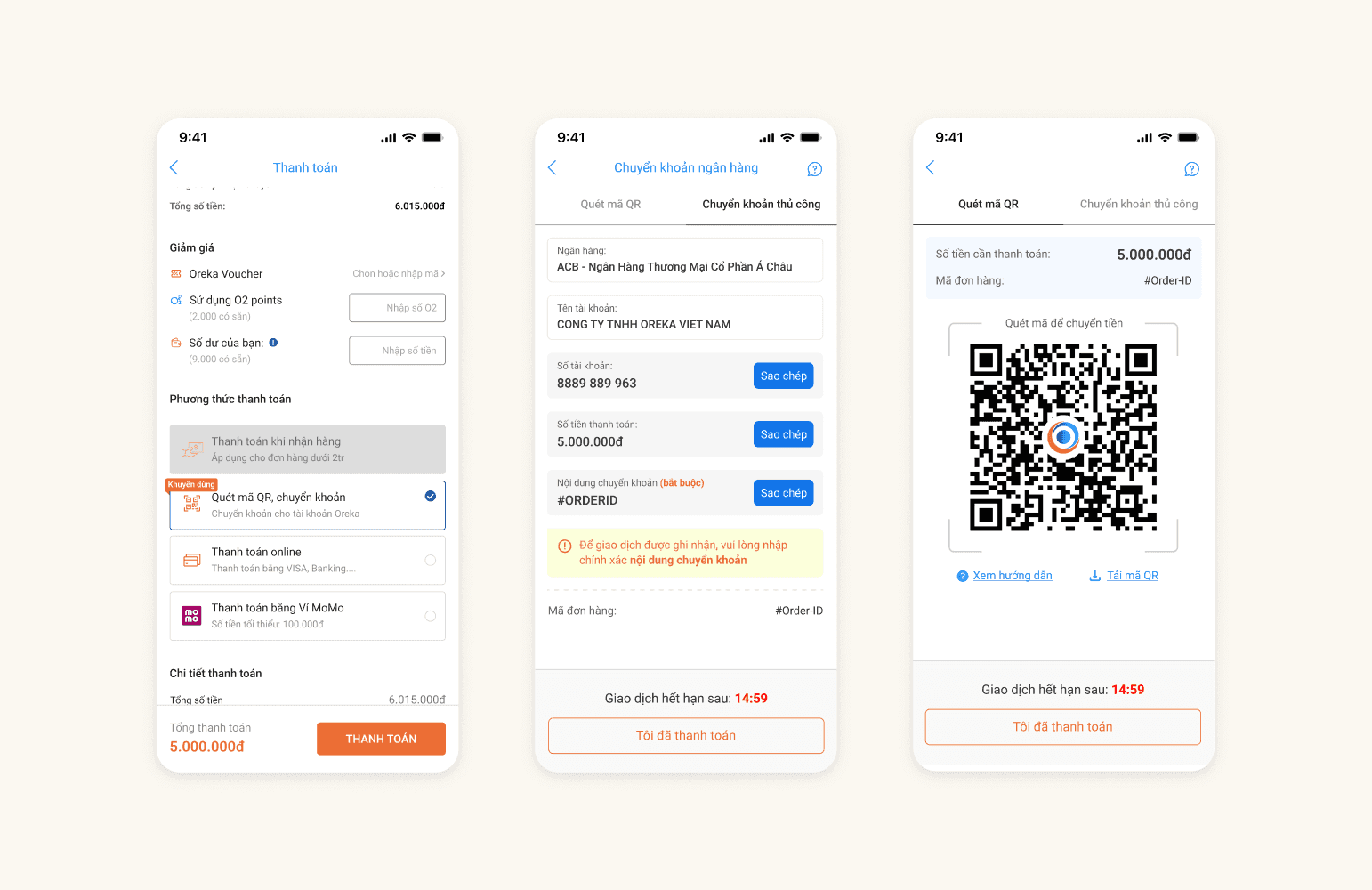
Bank QR code payment at checkout
I designed a bank QR code payment flow for Oreka. Online payments rose from 50% to 53.8%, and bank QR adoption reached 75%.
Oreka.vn· 2023