Oreka.vn · Aug 2023 – Present
Bank QR code payment at checkout
Oreka.vn is a Vietnamese marketplace for secondhand goods that started with used books and grew into high-value electronics. The more expensive the items, the more Momo and Visa transaction fees cut into the margin, while cash-on-delivery orders were often cancelled. I was asked to design a new way to pay: bank transfer by QR code.
- ROLE
- UI/UX Designer
- TIMELINE
- [TBD]
- TEAM
- [TBD]
- OUTCOME
- 50% → 53.8%
- online payments
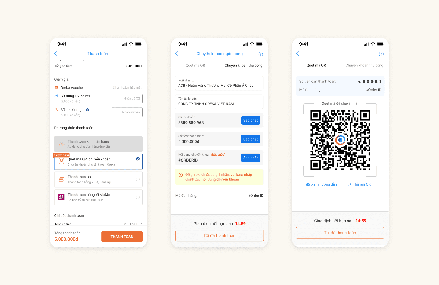
The problem
Oreka offered three ways to pay: COD carried no fee, while Momo charged 2% and Visa 2–5% per transaction, plus a 1% fee for the buyer. COD led to cancellations, so Oreka needed more buyers to pay upfront, yet both existing upfront options cost money. Buyers didn't lack the habit of paying through a bank — what they lacked was a way to pay that didn't go through a percentage-fee gateway. The goal: raise the online payment rate from 50% to 53%.
Before & after
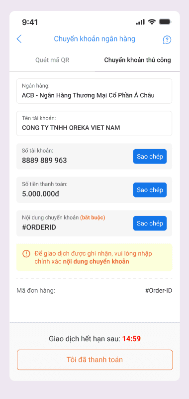
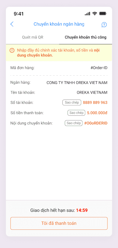
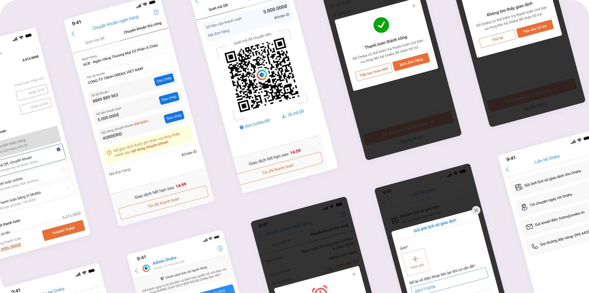
The clearest change after usability testing is in the manual transfer tab. Each detail moves into its own labelled box, the “Copy” button goes from a small grey outline to a solid blue button, the transfer-note reminder sits right below a field now marked “(required)”, and the “Bank” field shows ACB instead of the company name.
Process
[TBD: number of weeks], four phases, one question: how do we get buyers to pay upfront without Oreka losing a percentage to fees? I kept research costs low, chose a direction from existing payment data, and tested before launching in [TBD: launch date].
- ResearchDiscoverReviewed direct and indirect competitors and popular payment apps, alongside desk research: e-wallets (ZaloPay, VNPay, Viettel Money), Apple Pay, Google Pay and bank transfer by QR code.
- InsightDefineThree quarters of completed online orders were paid by Visa, so buyers were already used to paying by card and bank account. The obstacle was the fee, not the habit.
- DesignDesignChose bank QR after weighing business constraints and technical feasibility, then sketched paper wireframes for both methods: scanning the code and transferring manually.
- TestingValidateUsability-tested both methods with [TBD: number of participants]: 100% task completion. The copy buttons still caused friction, so the manual tab was reworked.
Solution
Buyers were already willing to pay through their bank, so the fix wasn't persuasion but structure: a four-step QR transfer branch — choose a method, transfer, open the banking app, confirm — that pays straight into Oreka's account without a fee gateway.
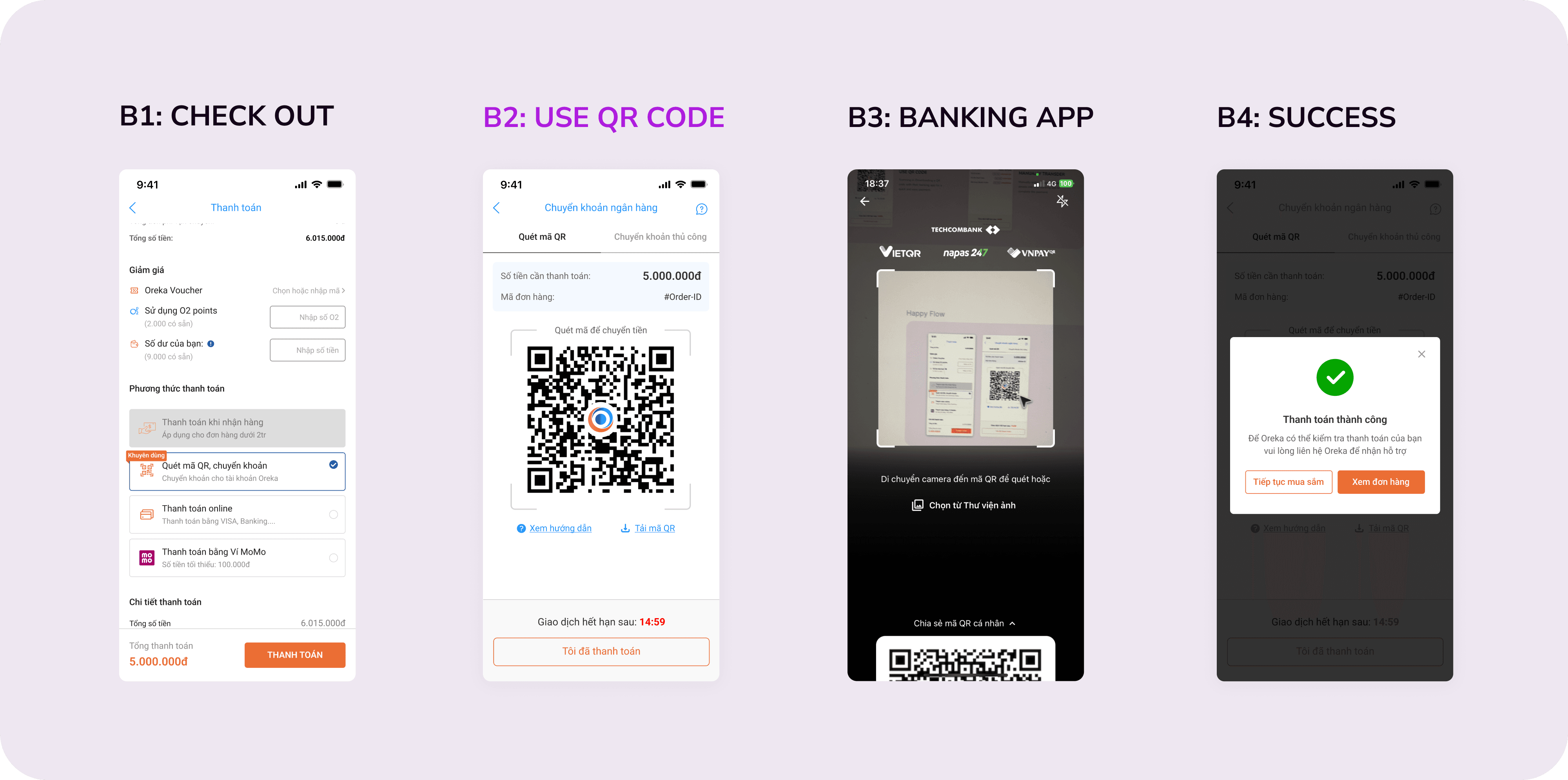
QR is preselected and tagged “Khuyên dùng” (Recommended) at checkout to steer buyers away from Momo and Visa. The transfer screen has two tabs (scan the code or transfer manually), a “Download QR” button for buyers shopping on their phone, and a 15-minute countdown for each transaction. When no transaction is found, a dialog offers “Try again” or “Request support”, and the “Contact Oreka” screen accepts a screenshot of the transaction history.
Results
Both numbers track the two initial goals: more buyers paying upfront, and moving buyers off fee-charging gateways.
Takeaways
- Read the existing payment data before looking for a new method. Three quarters of online orders paid by Visa showed buyers were ready to pay through a bank; the design's job was to remove the fee, not teach a new habit.
- Cheap research can still pick the direction. A competitor review, desk research and paper wireframes cost little, yet they were enough to reach a measurable result.
- Set a numeric goal from the start. The 50%-to-53% target gave me a clear benchmark to judge the outcome after launch. [TBD: a lesson involving a trade-off — something I would do differently or something still unmeasured]
You might also like
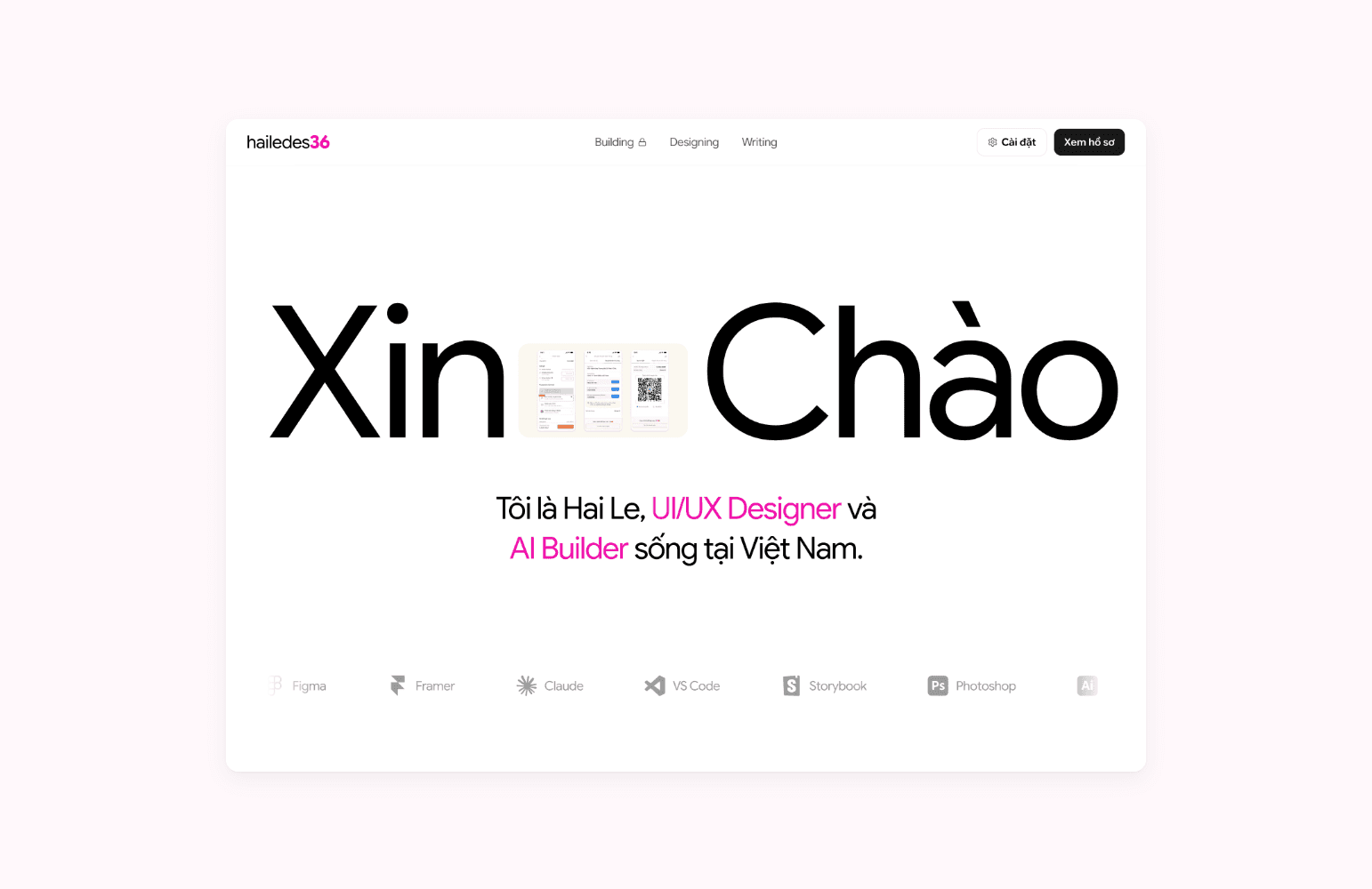
Building this portfolio 100% with Claude and VS Code
I researched, designed, coded and shipped this bilingual portfolio on my own, using only Claude, VS Code, Git and Vercel.
Personal project· 2026
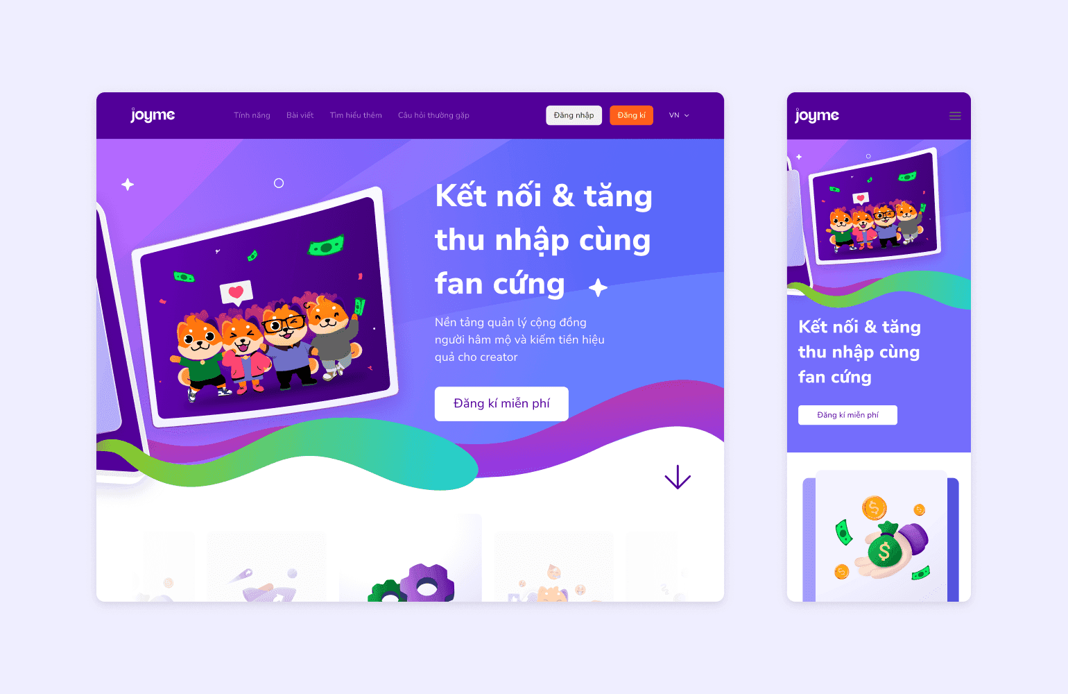
Designing the first version of Joyme in three months
I did UX research, UX, UI and the design system for Joyme, a platform where KOLs and KOCs build a personal page and get paid by their fans.
Joyme.io· 2022
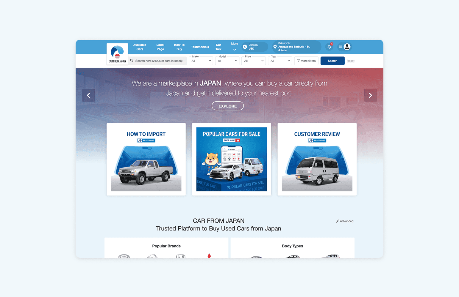
Redesigning the inquiry form to reduce drop-off
About 90% of Carfromjapan.com users left at the inquiry form. I redesigned the button, form and confirmation; the new flow is in an A/B test.
Carfromjapan.com· 2023